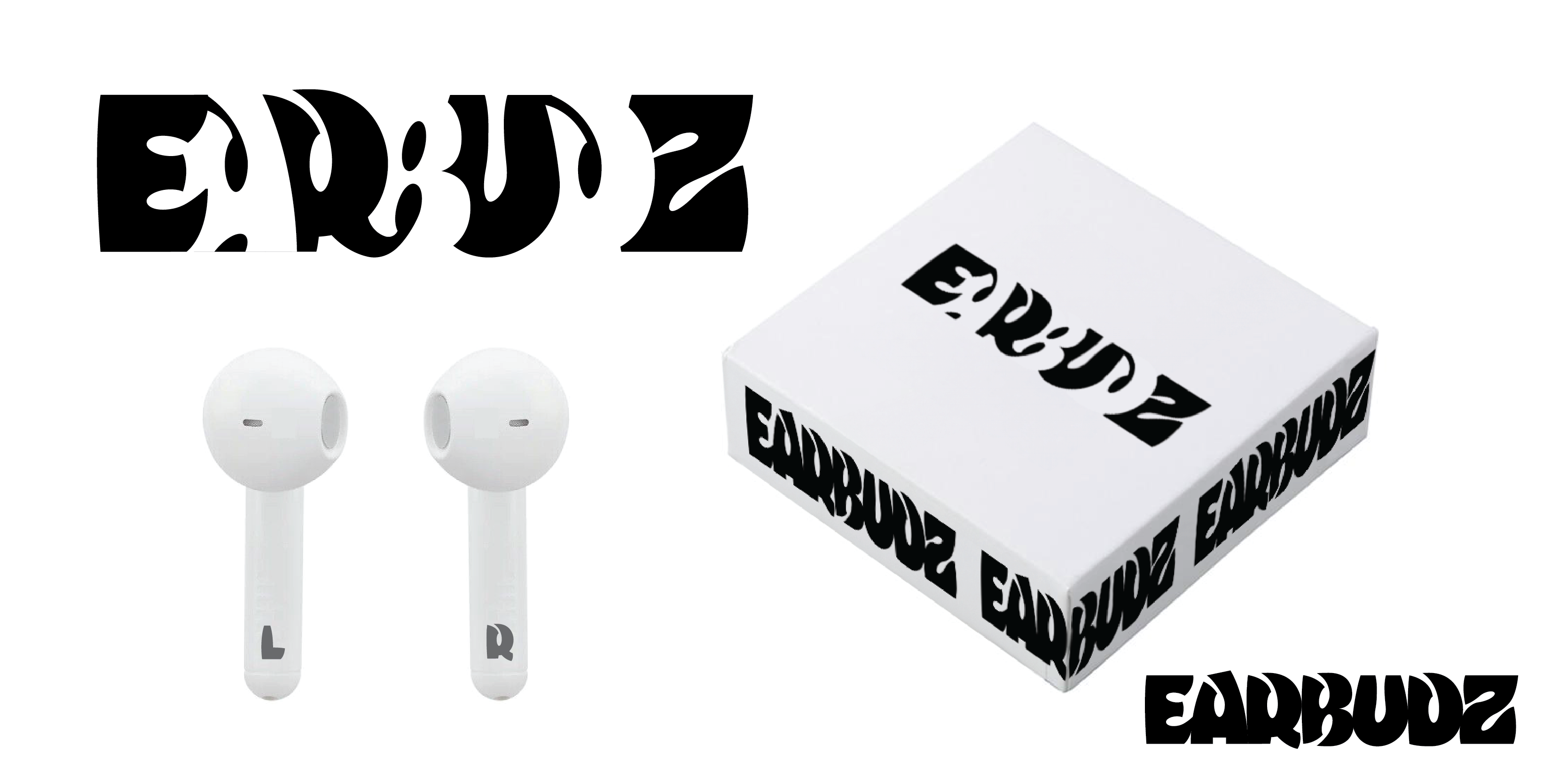
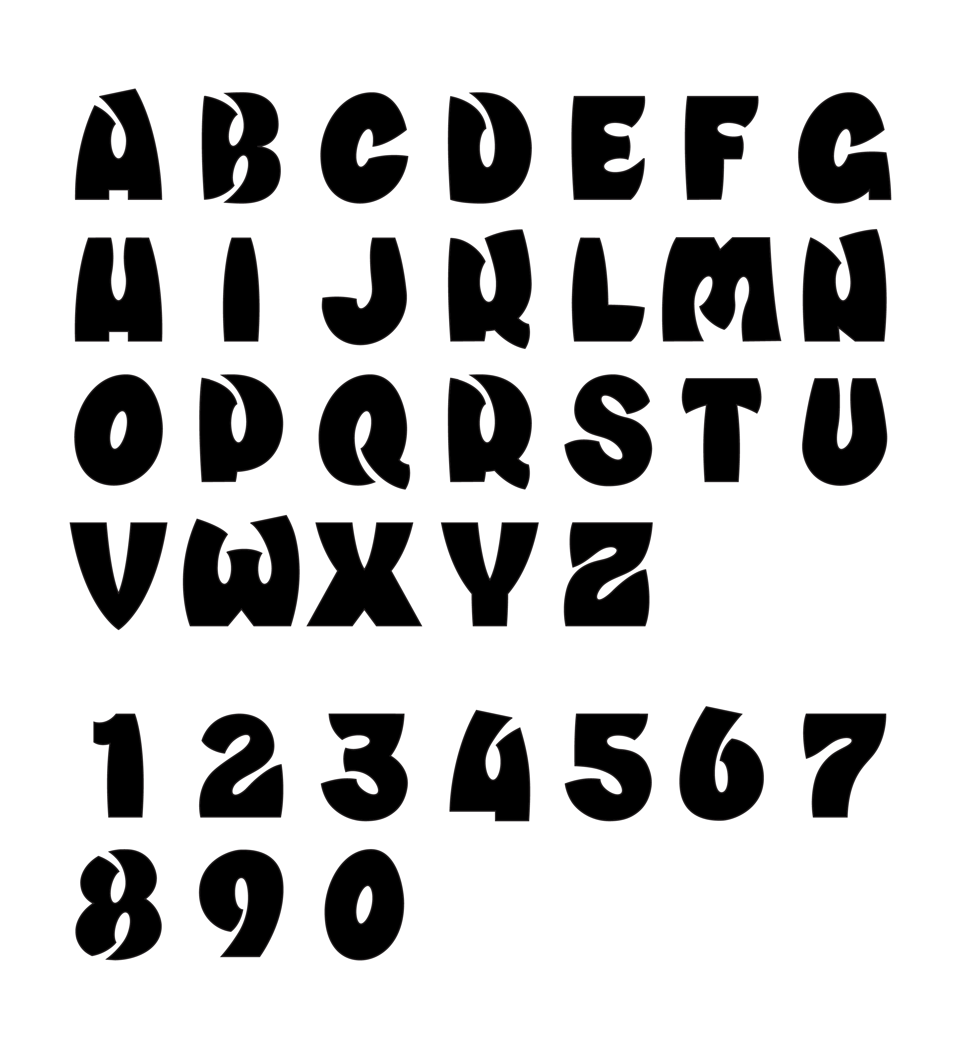
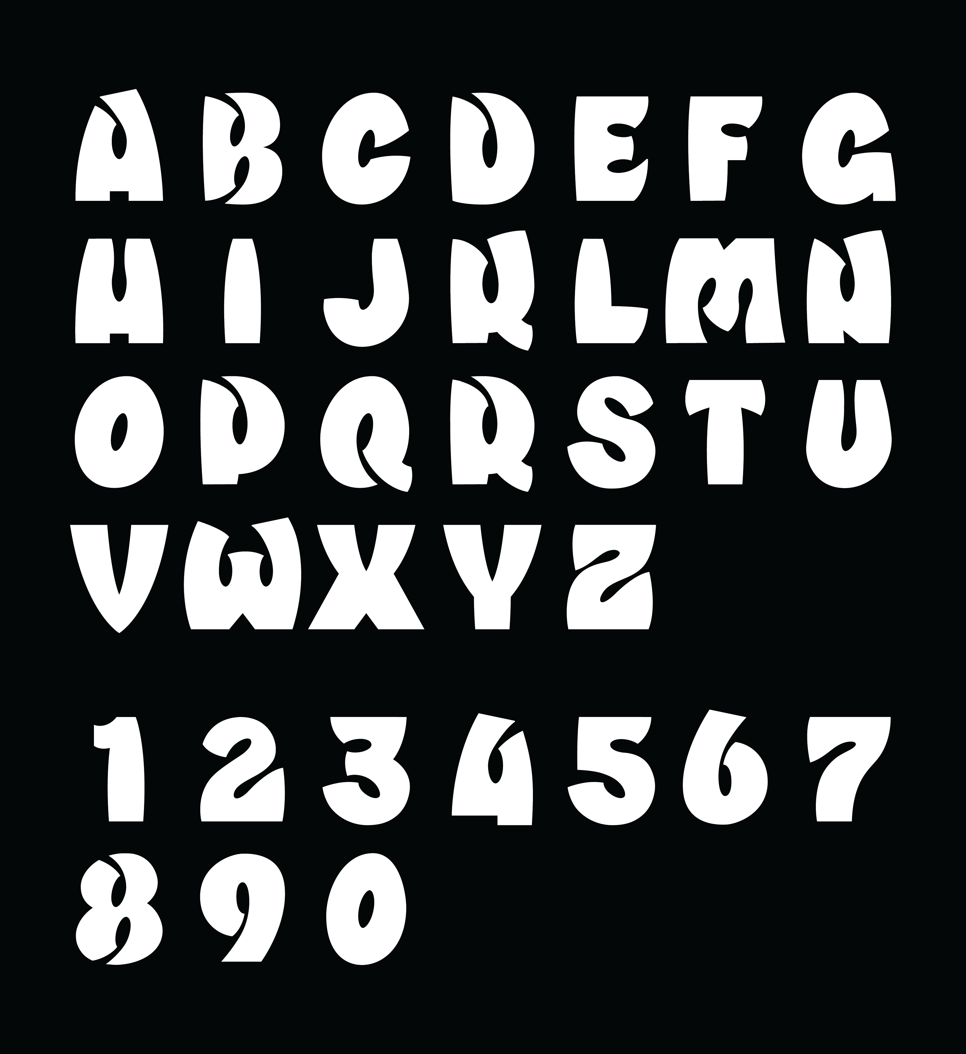
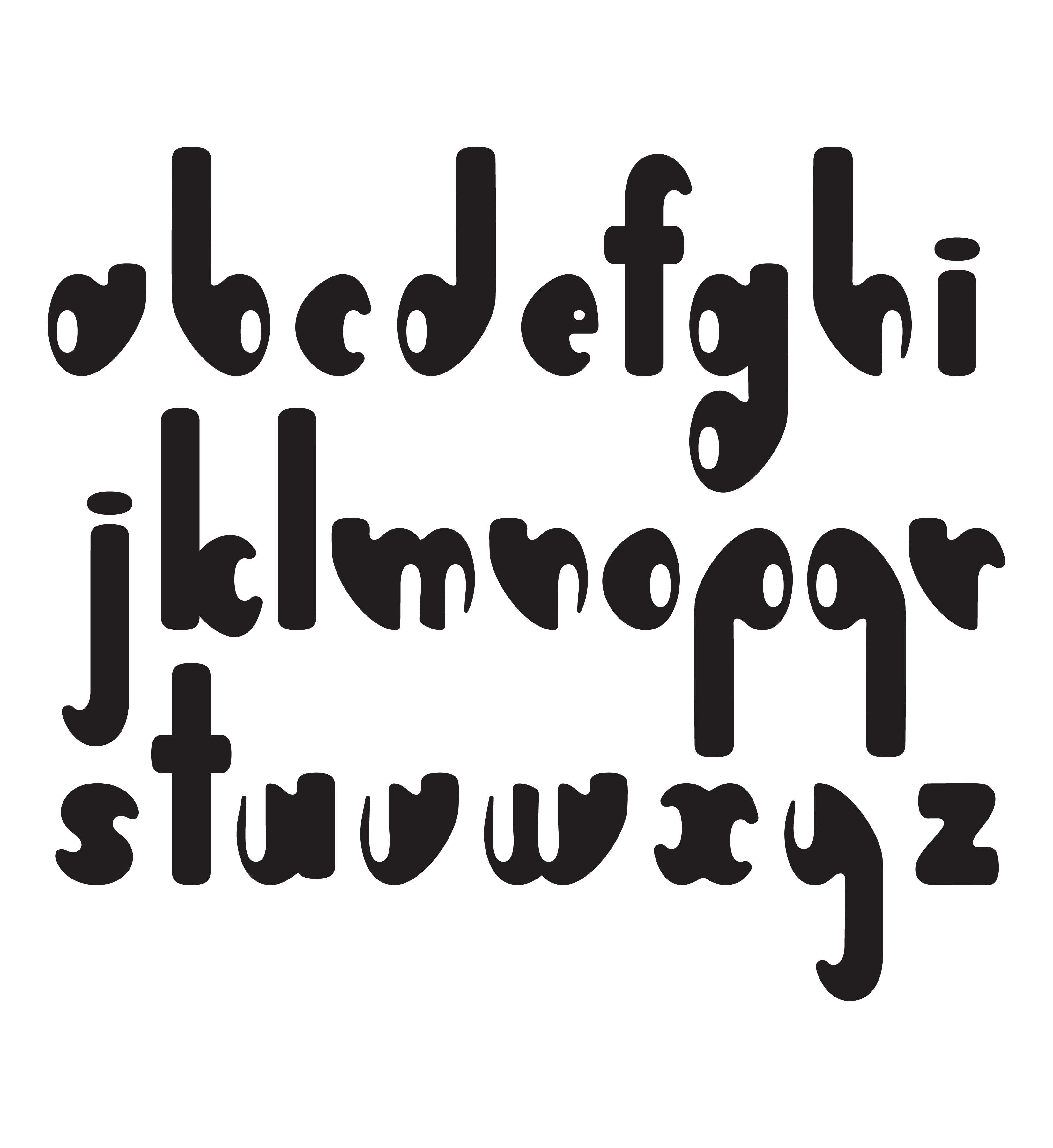
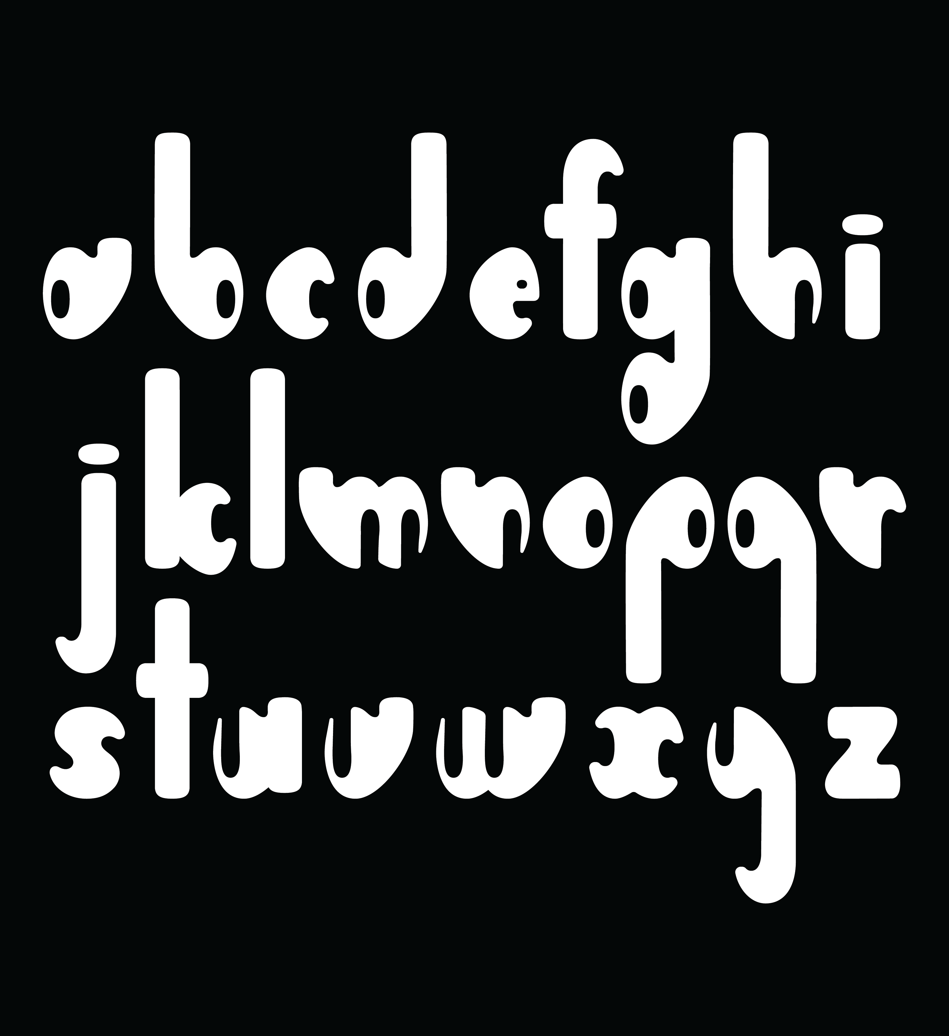
I created the display typeface EARBUDZ after being inspired by a unique A-shaped cutout in a Subway platform advertisement. The ovals and tunnels that sneak through each letterform resemble ear canals and ear buds, hence its name.
Designed to grab attention, the heavy weight of EARBUDZ turns up the volume of any title or logo it touches.

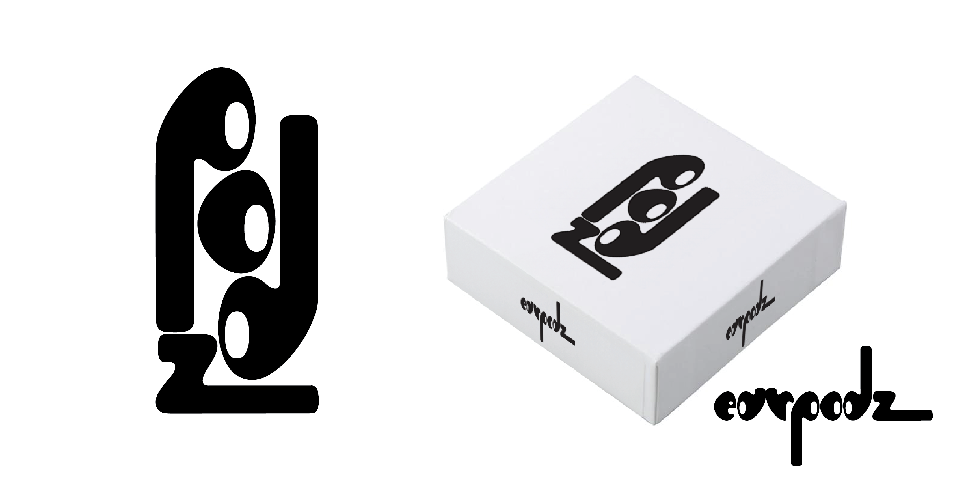
While working on logo and earbud packaging ideas for EARBUDZ, I realized that I could make letterforms with actual earbuds themselves.
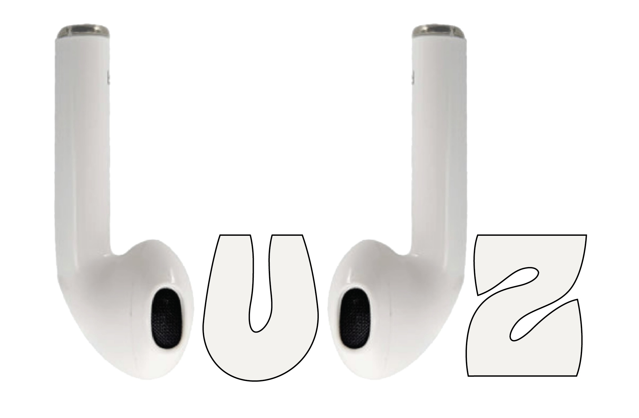
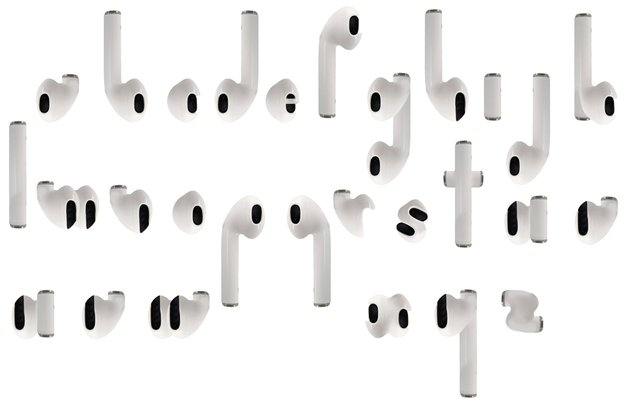
I pieced together an earbud alphabet on Photoshop, then took it to Illustrator to refine the characters more. What emerged was earpodz, a modular typeface and the lowercase spiritual successor to EARBUDZ.

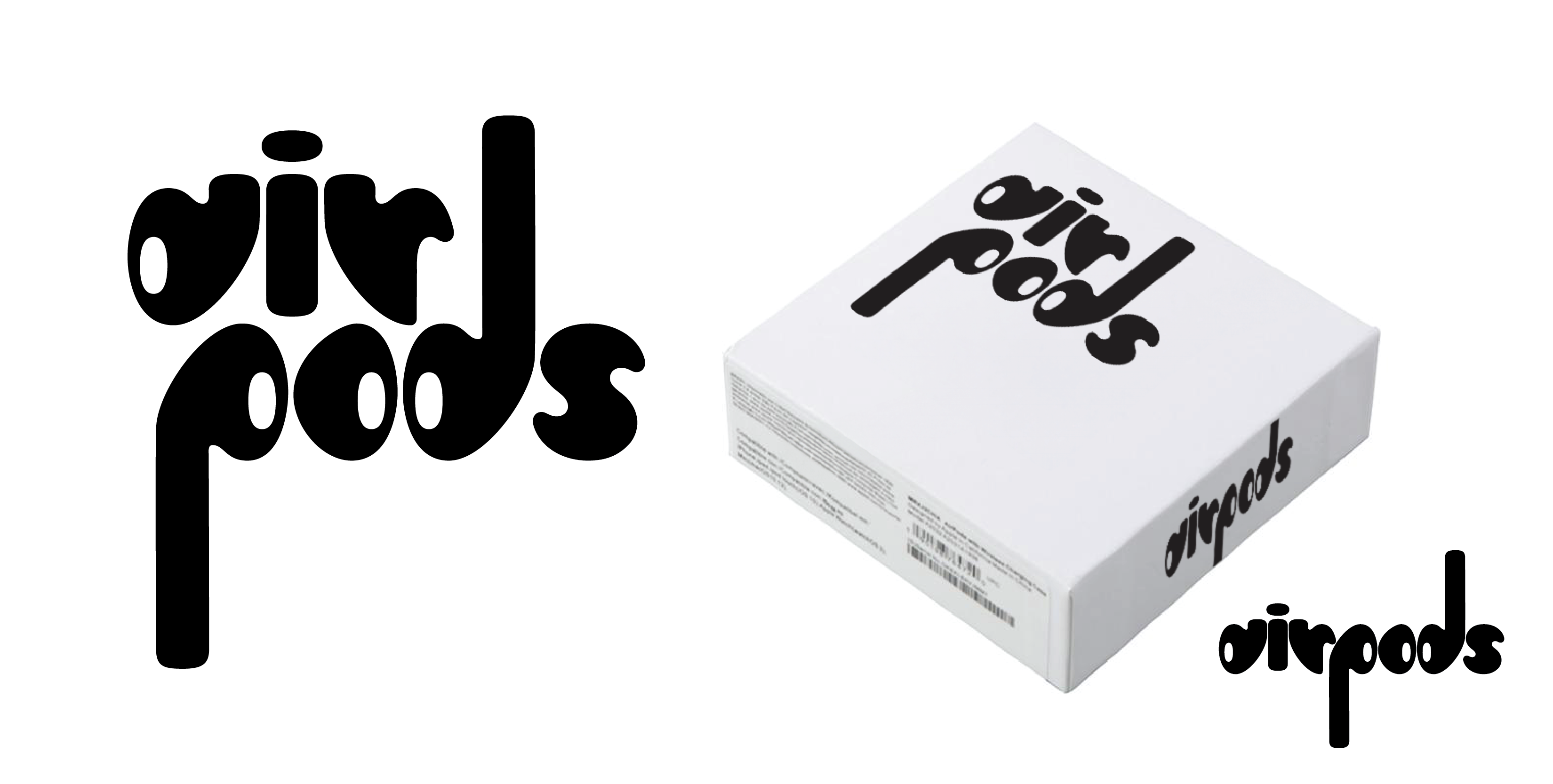
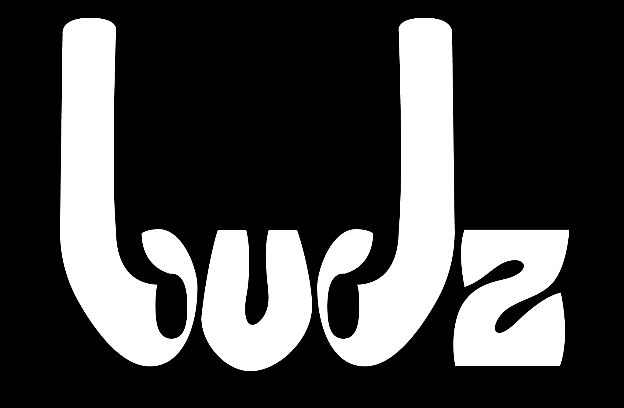
I also made some mockups to show these typefaces in use: