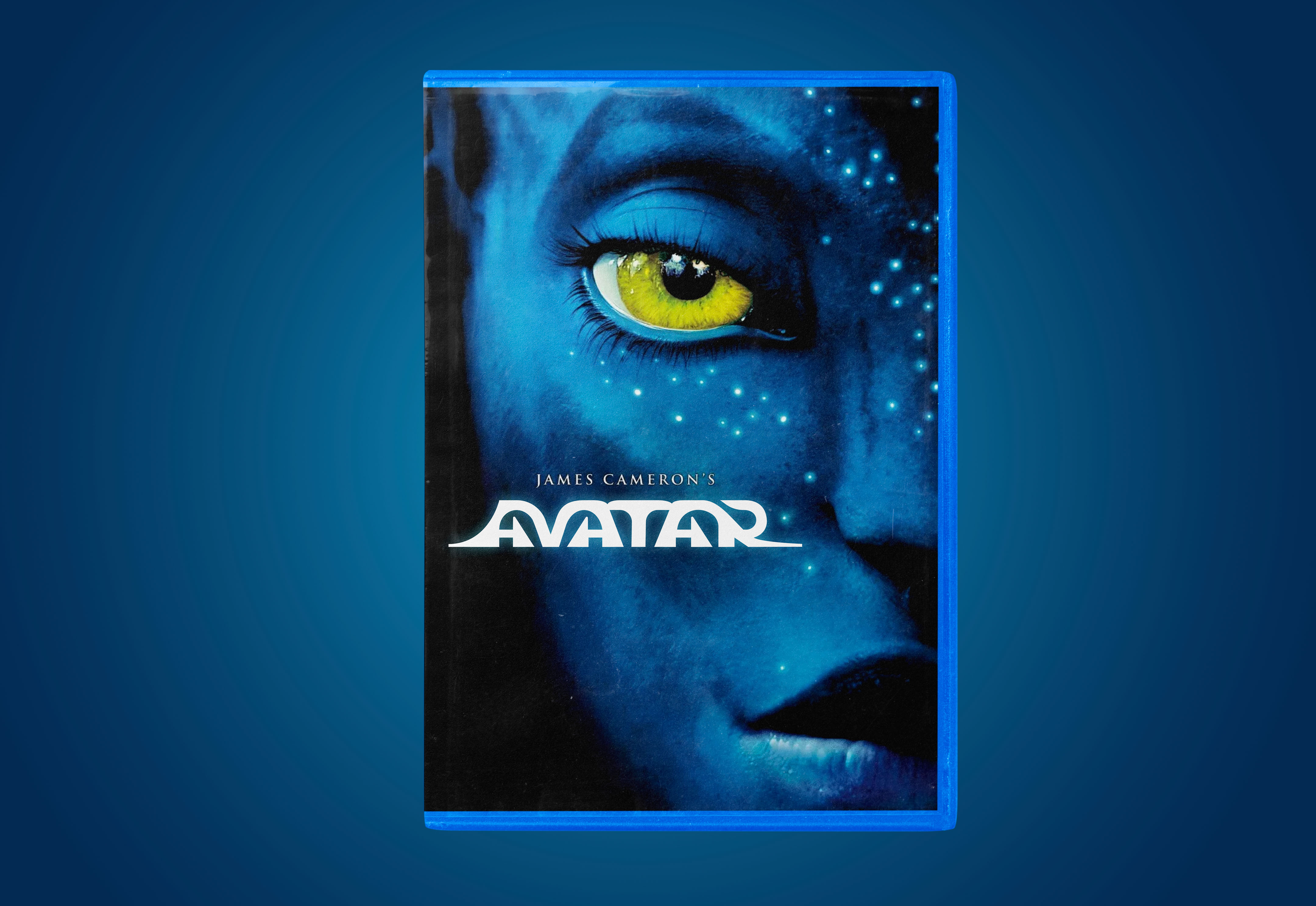
Here’s my non-Papyrus redesign of the Avatar film franchise logo:

The contrast between the hard corners on the bottom of each letter and the rounded path shaping the top represents the struggle faced by the film’s protagonist, who becomes caught between a brutal, mechanical human world and Pandora, where the Na’vi and nature are interconnected. Starting with this concept, I gradually made edits until acheiving the final typographic result:


